Spring called, and Provia answered.
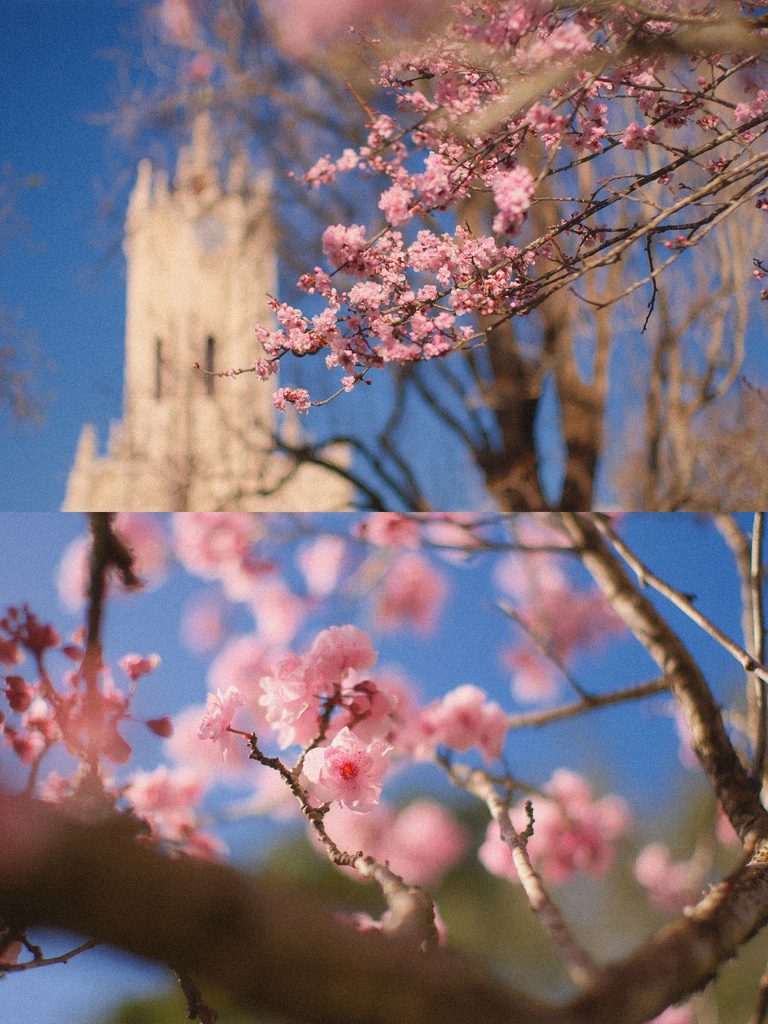
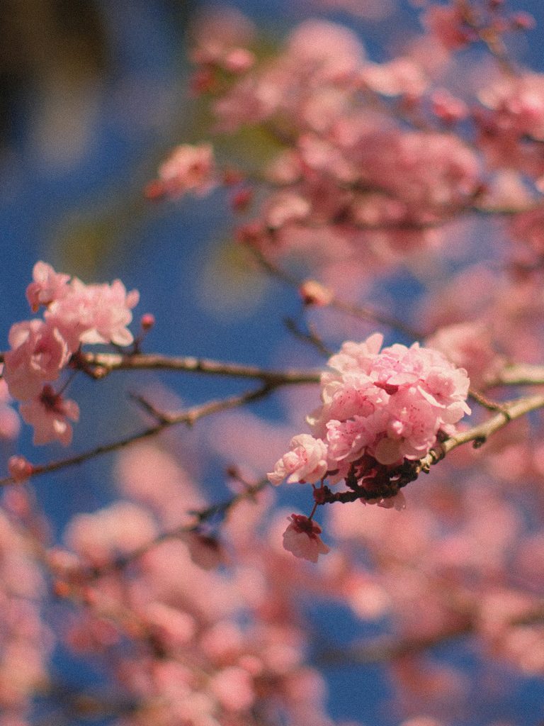
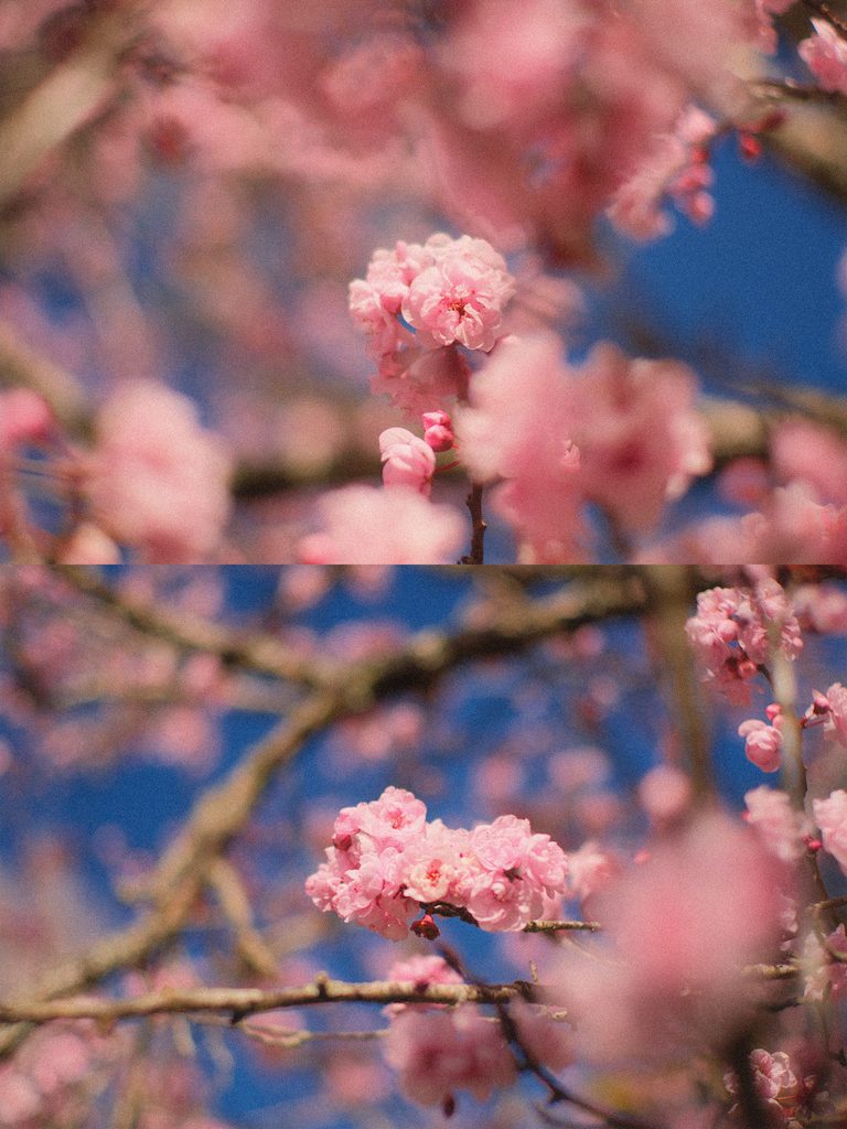
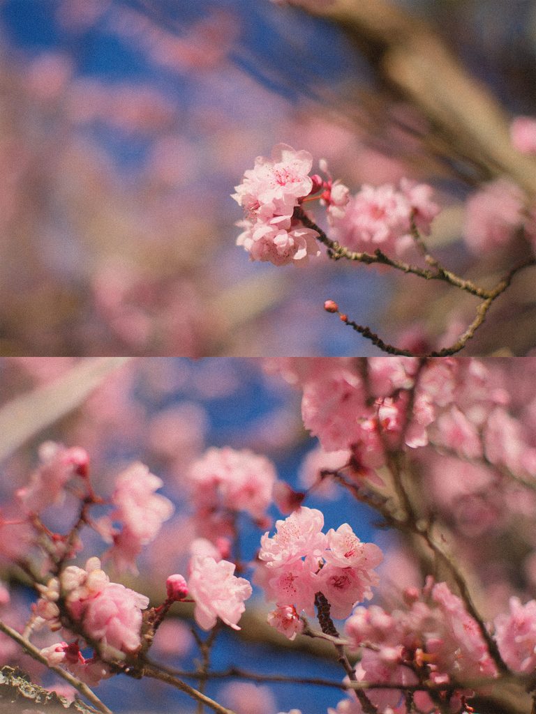
There’s something about spring that makes me want to slow down and photograph everything — the soft pink blossoms, fresh green leaves, bright blue skies, and those little moments that make the season feel almost dreamlike.
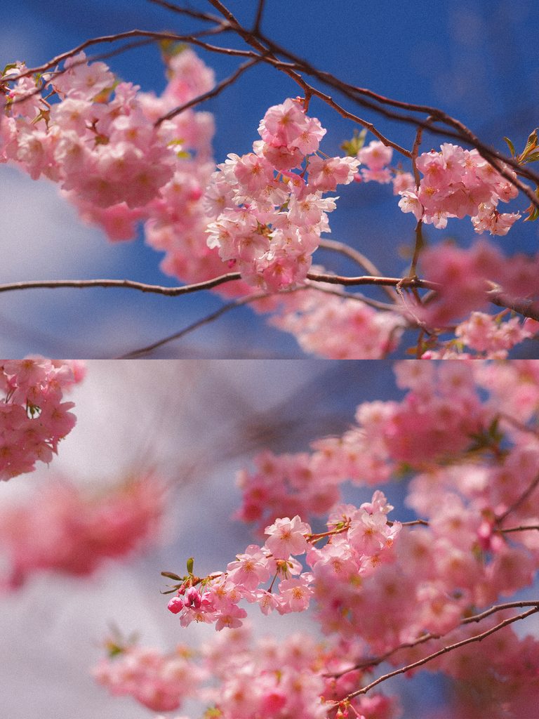
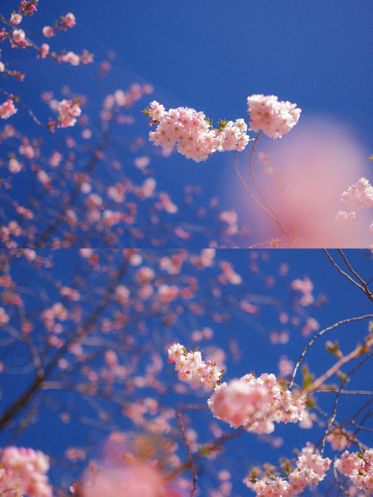
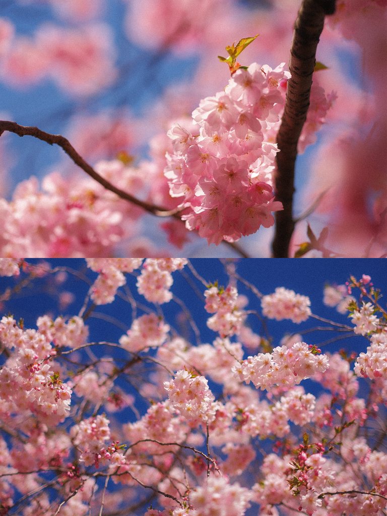
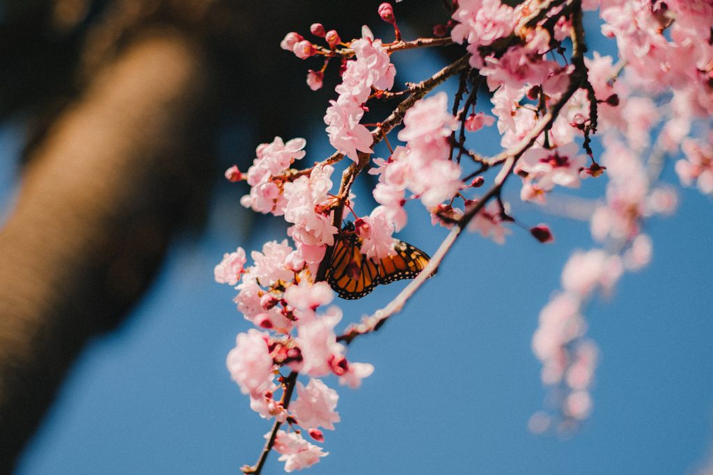
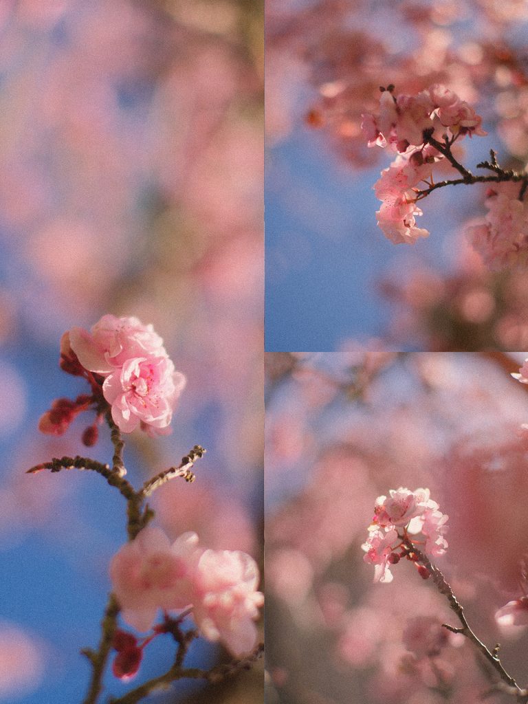
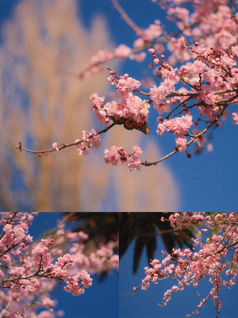
For this series, I wanted a look that felt soft and pastel without becoming too muted. I’ve experimented with quite a few Fujifilm film simulations, but I kept coming back to Provia/Standard. With a little extra colour and a cooler balance in the highlights, it gives me exactly the spring feeling I was looking for: delicate pinks, vibrant colours, and plenty of depth in the sky.
The best part?
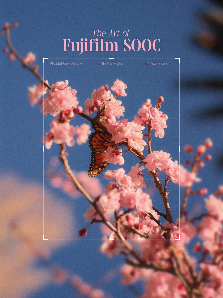
These photos are completely straight out of camera.
No Lightroom. No Photoshop. No colour grading. Just my Fujifilm X-T5, this recipe, and whatever spring decided to give me that day.
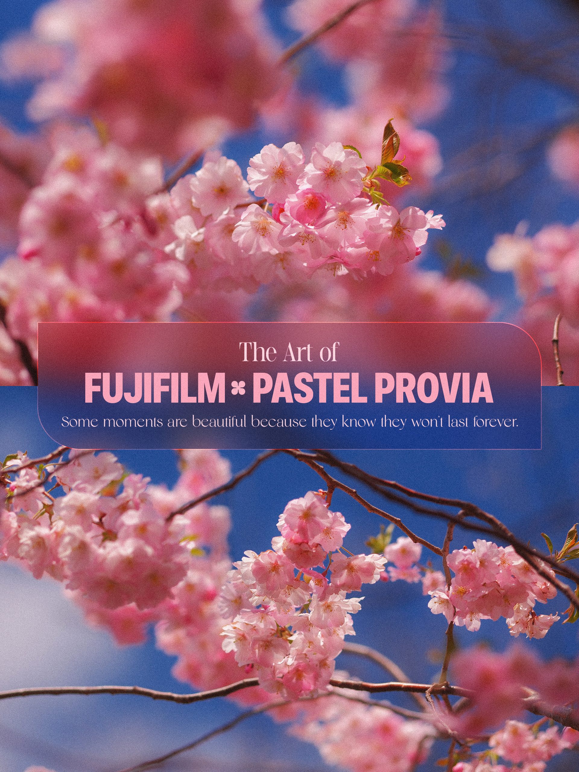
📸 The Pastel Provia Recipe
Here are the settings I used:
| Setting | Recipe |
|---|---|
| Film Simulation | Provia / Standard |
| Dynamic Range | DR100 |
| Highlight | -2 |
| Shadow | -1.5 |
| Color | +4 |
| Clarity | -4 |
| Noise Reduction | -4 |
| White Balance | Auto |
| WB Shift | R +5 / B -3 |
| Grain Effect | Strong / Small |
| Color Chrome FX Blue | Strong / Weak |
🌸 Why Provia?
Provia is often thought of as Fujifilm’s more neutral, everyday film simulation, but that’s exactly what makes it such a good starting point for this recipe.
Pushing the Color to +4 gives the flowers and foliage more presence, while the Auto White Balance with R+5 and B-3 adds a subtle warmth that works beautifully with pink blossoms.
I also pulled the Highlights down to -2 and Shadows to -1.5 to keep the contrast under control. This helps create that softer, dreamy feeling without completely flattening the image.
The biggest part of the look for me, though, is Clarity -4.
It takes a little crispness away from the image and gives the photographs a softer rendering straight from the camera. Combined with the Strong, Small grain, it adds just enough texture to make the files feel less clinically digital.
And when the light hits the blossoms just right?
That’s where the recipe really comes alive.
☀️ Best Conditions for the Recipe
I’ve found this recipe works especially well in bright spring conditions, particularly when you’re photographing flowers, trees, gardens, portraits, or colourful scenes under natural light.
It really shines when you have:
- 🌸 Pink, white or pastel flowers
- 🌿 Fresh green foliage
- ☀️ Bright sunlight
- 💙 Deep blue skies
- 🦋 Small details and close-up subjects
- ✨ Backlit or gently side-lit scenes
The combination of soft highlights, punchy colour and the slightly softened rendering works particularly well for spring photography.
Of course, don’t feel like you have to follow the recipe perfectly. Fujifilm recipes are starting points — the light, weather and subject will always influence the final result.
📷 Straight Out of Camera
One of the reasons I enjoy shooting recipes like this is that it changes the way I photograph.
Instead of thinking about how I’m going to fix an image later, I’m thinking about how I want the photograph to look before I press the shutter.
The colour, exposure, light and composition all become part of the process.
And when the image comes out of the camera looking the way you imagined it?
That’s a pretty satisfying feeling.
For this series, I didn’t need to open Lightroom afterwards. The files already had the colour and atmosphere I wanted.
Just Fuji colours, spring light and a little bit of patience.
🌸 Give It a Try
If you have a Fujifilm camera, save this recipe and take it out on your next sunny-day walk.
Shoot some flowers. Find some interesting light. Look for colour. Get close to the details.
And most importantly — have fun with it.
If you try the recipe, I’d love to see what you create with it. Your spring might look completely different from mine, and that’s part of the fun.
Spring called. Provia answered. 🌸
More spring photographs coming soon.
Leave a Reply